As I mentioned in my last post, light has one of the most important effects on our images. While light provides the color impact to an image, the construction of our composition provides structural information to our brains. Due to this fact, we need to align the physical elements perfectly to create better landscape compositions.
For us, the purpose of taking landscape photos is mainly to wow the viewer, right? The question is how can we make a better impression? Sometimes, it’s not enough to just take a photo of an iconic location – we need to improve the scene compositionally to make it more appealing.
Note the structure
It’s not always as easy as it seems, but with common natural structures and some practice aligning components, you can learn how to get better results. Composition also has rules and settings that we can follow and apply.
When I started learning landscape photography, I immediately put more effort into analyzing the compositions of professional photographers, and in addition, worked hard to find out the best way to compose and why their images had a better effect. As I studied and gained more knowledge on the subject, I began to implement my techniques for specific scenes.
I start drawing lines on photos that I find visually compelling to get an idea of the best placement of supporting elements. Later on, it becomes easier for me to avoid interfering components on the site and create stronger compositions. For example: moving one step forward can help get rid of a tree that isn’t participating in the frame. Or moving a little lower might help find a leading line.
Analyzing Paintings
Another approach is to study landscapes by painters such as Albert Bierstadt and William Turner. We can learn a lot from them, and they have collected a wealth of information about composition and the behavior of light. Their pictures can be very helpful to us landscape photographers to apply their valuable findings to our work.
Keep it simple
While light is as important as the composition itself, the structure of the image has a greater psychological impact on us. It should be simple and we need to avoid all the clutter in the frame to provide a clearer result. The most important principle here is simplicity and placing other visual elements that complete the shot. It can be anything from leading lines, pointing rocks to dramatic clouds. As a result, we can easily create better landscape compositions.
Think in Shape
Think of geometric shapes. Instead of asking our brain to process every little detail on the scene, which is hard to ignore, try to see the scene elements as geometric shapes: triangles, circles, lines. Why? Because using this technique simplifies the scene and convinces us to focus on complex objects.
Ask yourself
We always need to ask ourselves what works best in the current scene. Do I need to use diagonal lines to lead the viewer’s eye, or will the surrounding trees create a better effect? Where should I place elements to fit perfectly into my composition?
There are some great ways to get these techniques, and I’m going to tell you 7 simple composition setups that are very easy to achieve.
Mirror
I think this is the easiest composition to use. As the name suggests, we need to place the horizon in the center to get a perfect mirror effect.
While it doesn’t necessarily have to be in the middle, be careful not to cut anything important out of the frame.
It can be a tree, an animal, or a mountain. The subject is reflected on the lake surface, and the whole is presented, which is very pleasing to the eye. I always try this method when I survey the lake.
 High Tatras, Slovakia – Gabor Boszormenyi
snake
Although this is a leading line, I call it a snake because the sinuous line runs through the picture, drawing the viewer’s attention to our subject. It works best with curved rivers, roads, or trees with odd shapes. The main reason for using this element is to force the viewer’s eyes to move along the curve. Also, the S-curve is a very elegant and convenient shape for our eyes.
Remember shape thinking? That’s also a useful technique that we can apply in this example.
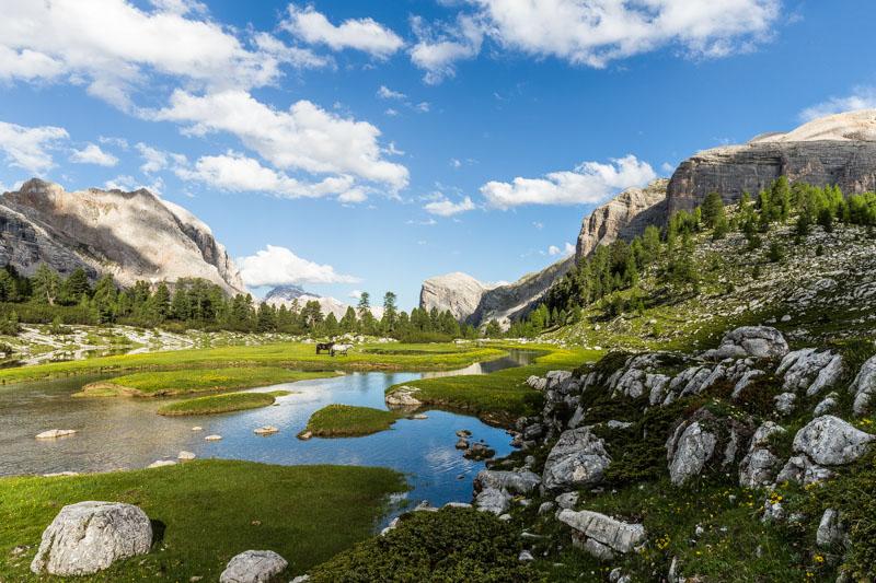 Italian Fanes Sennes Braies – Gabor Boszormenyi
Layers
Placing objects on top of each other can create a huge visual impact because the elements overlap each other through the frame.
Typically I use a telephoto lens to create this kind of composition as it subtly compresses distances and also gives the scene a narrower depth of field.
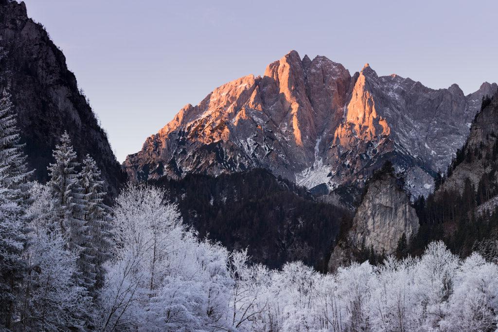 Hochtor, Austria – Gabor Boszormenyi
frame
I’m sure you’ve seen plenty of examples of this. The idea of placing a visual frame in the foreground can be very striking. In this case, the possibilities are almost endless. I’ve seen great photos taken from caves because the cave entrances formed a natural frame for the photo. We must be careful, though, that the frame doesn’t take the focus away from the main subject.
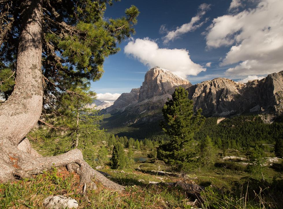 Dolomites, Italy – Gabor Boszormenyi
pointer
This is where shaping techniques come in handy. The key is to find a foreground object that points to our main subject. One of the most effective ways to do this is by directing the viewer’s eye. In the example below, I’ve used rock formations to point to my subject, which is the mountain. Do you realize how these simple elements can draw attention? Like that old tree trunk that points to the waterfall.
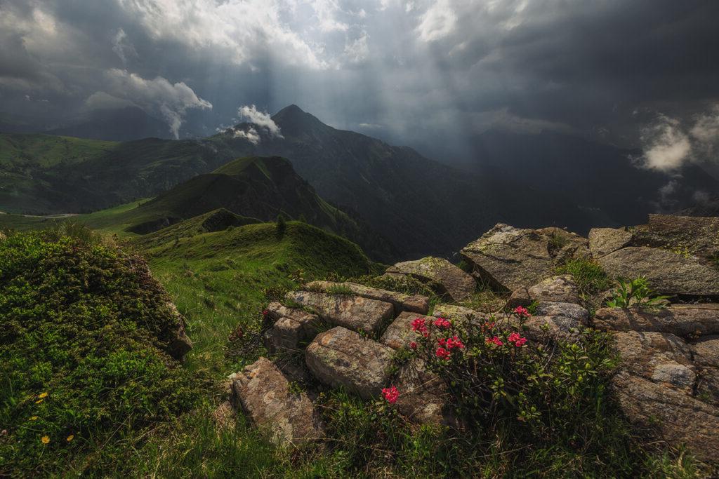 Passo di Giau, Italy – Gabor Boszormenyi
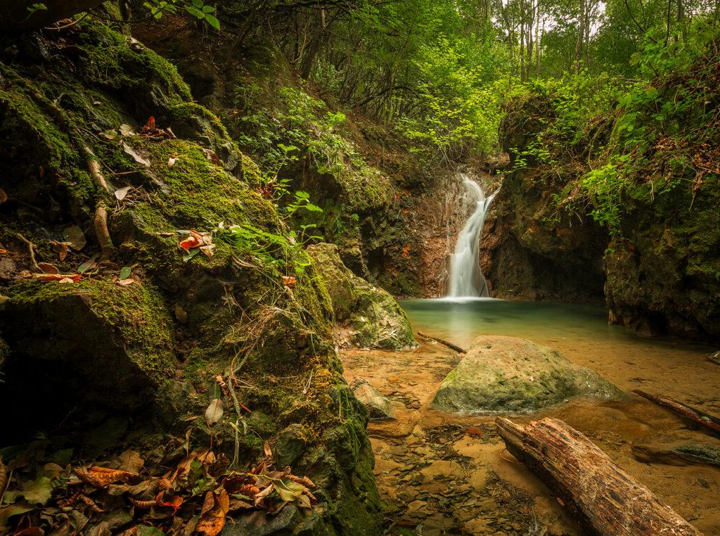 Hungary’s Hidden Waterfall – Gabor Boszormenyi
crossroads
Forest streams and waterfalls are often difficult to photograph. By using this composition technique, we can easily force the viewer’s eye to scan across the frame. The key is to place the subject in a diagonal manner, like the mountain or waterfall in this photo. Diagonals can easily draw attention to the image.
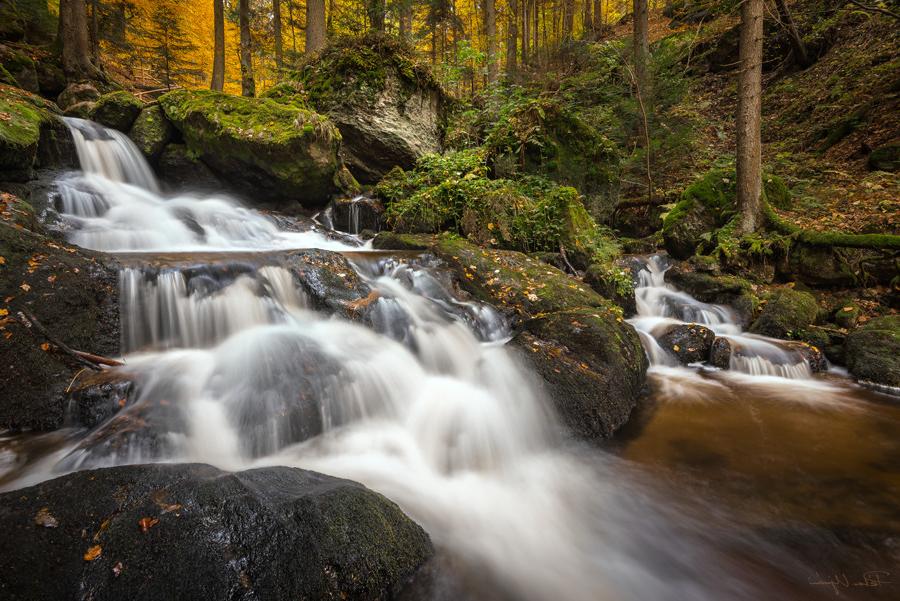 Ispeklam, Austria – Peter Uivari
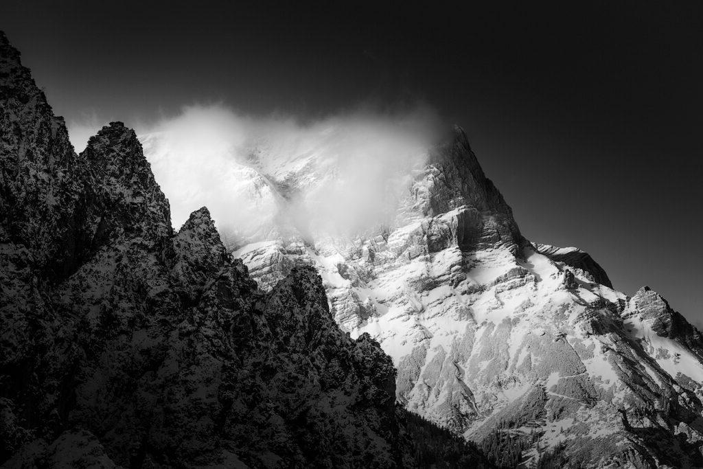 Grosser Buchstein, Austria – Gabor Boszormenyi
close up
If you find a striking foreground element, be sure to get closer. It can support the structure of your composition and better impact your audience. This requires a wide-angle lens to achieve. Most of the time, flowers can perfectly provide these foreground elements, although it can be anything that is visually appealing. It’s even better if the shape or color of the foreground element matches the background.
In the image below I used seaweed and small pool shapes to create a nice depth of field.
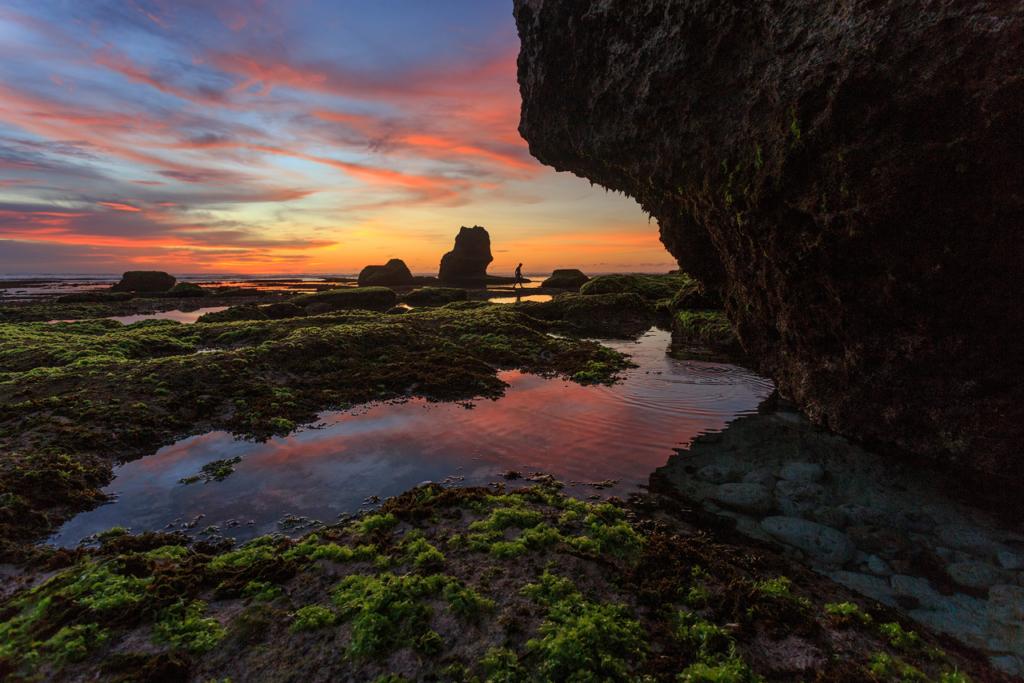 Greenbowl Beach, Indonesia – Gabor Boszormenyi
Pay attention to where your eye rests and make the most of the scene. It can be cluttered at times, so only include elements that are visually striking. So, with the above tips, you can create better landscape compositions. If you have anything to add to my thoughts, please leave a comment below.
Copy this article How to Easily Create Better Landscape Compositions
please put the source on the website svlsf.edu.vn
Categories: Biography
Source: svlsf.edu.vn
